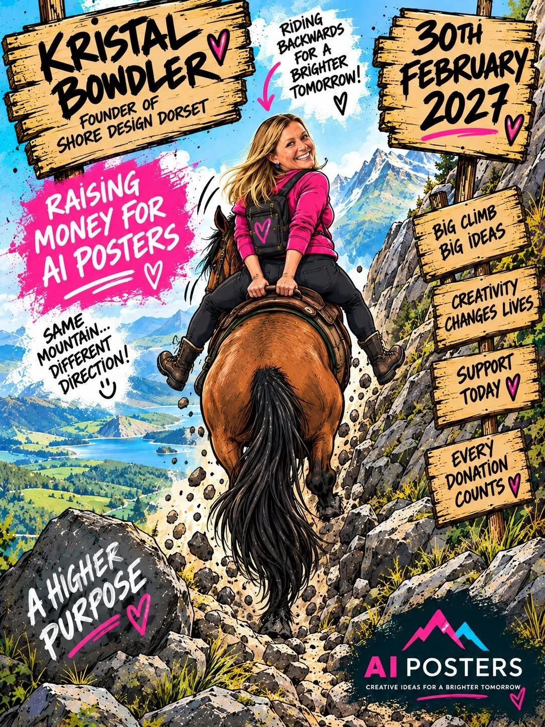
Why Everyone's AI Poster Is Starting to Look the Same
Full disclosure: I use AI to knock out a poster myself when I'm pushed for time. It's a genuinely great tool for a quick turnaround, and there's no shame in admitting that.
But here's the thing… everyone's using it…
And everyone's posters are starting to look the same. Same layouts, same icons, that "seen this exact style a hundred times" feeling.
The details are worth checking
AI is confident, not always accurate. Things that are easy to miss if you're not looking closely:
A poster date that doesn't actually exist
An icon that doesn't quite make sense in context
A layout that's near-identical to five others you scrolled past this week
The wrong size for social media or print - even after you've specifically asked it to resize
Where I land on it
AI's a brilliant shortcut when time's tight. It's just not a substitute for design that actually looks like you, and that's still the bit I care about most.
Need a poster that actually makes sense and looks like your brand, not everyone else's?
Get in touch and let's sort it properly.